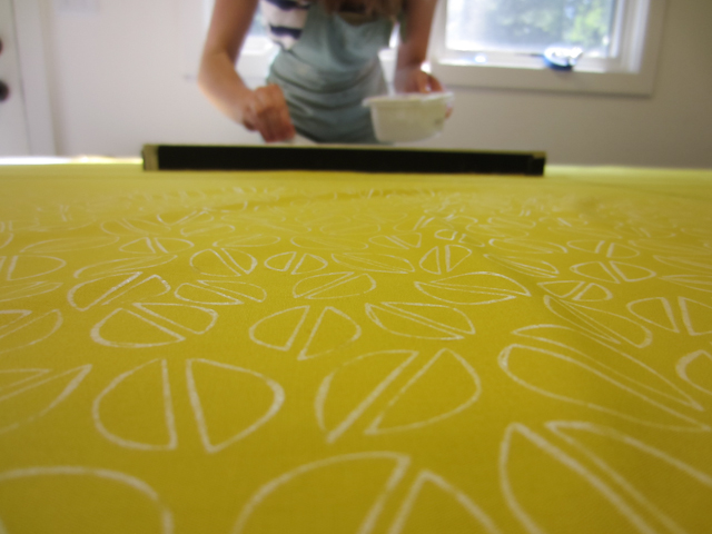
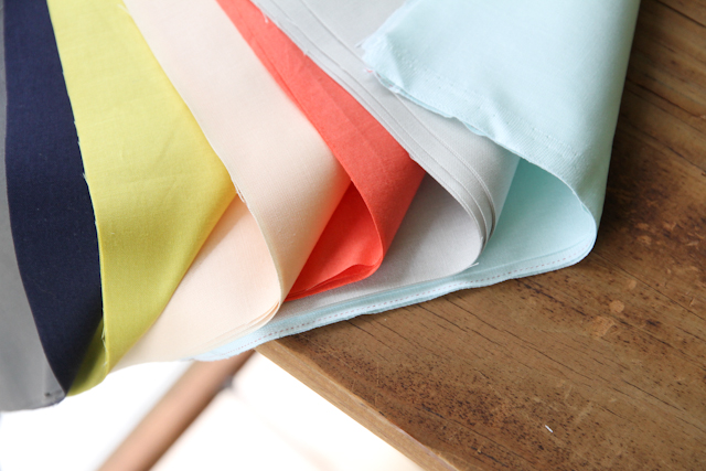
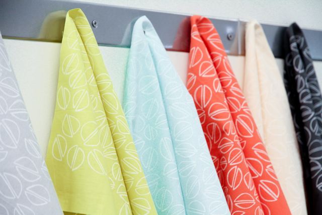
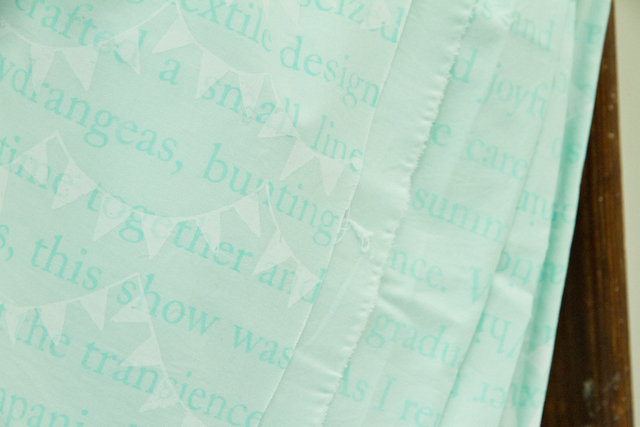
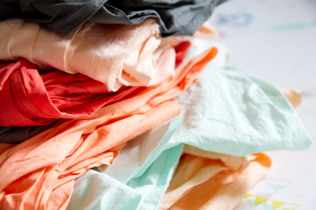
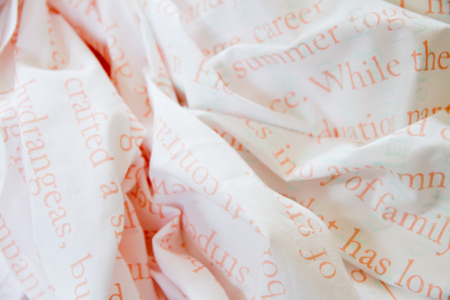
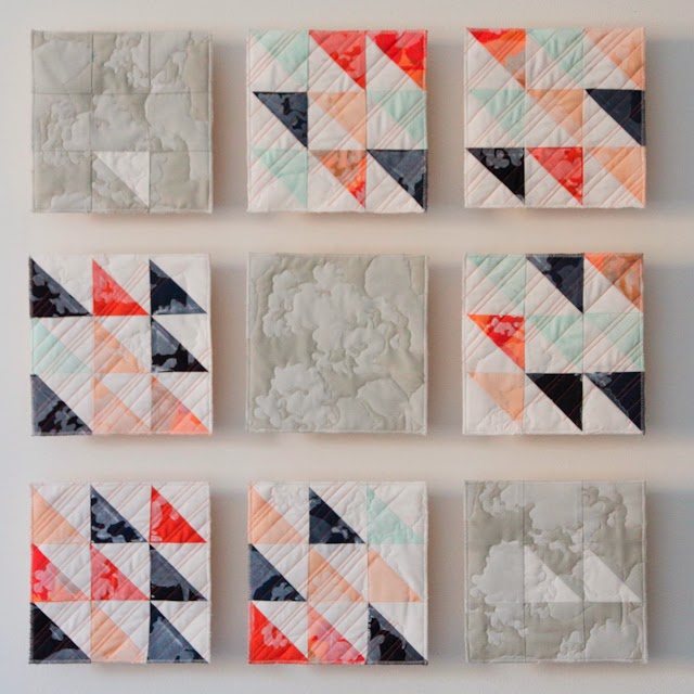
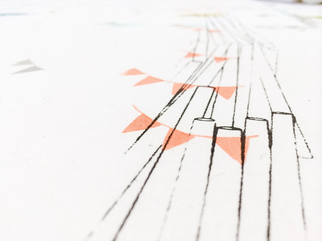
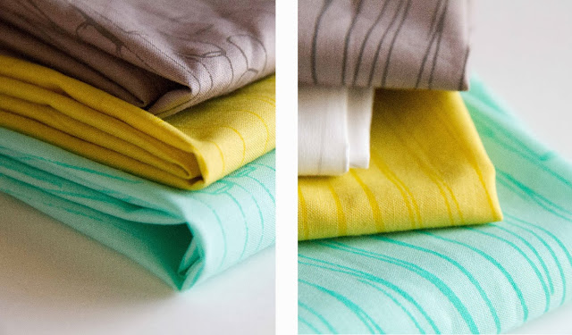
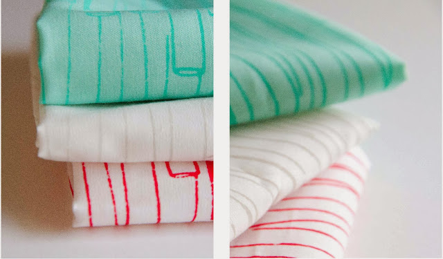
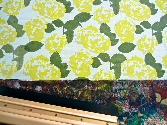
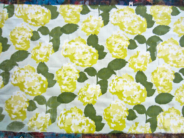
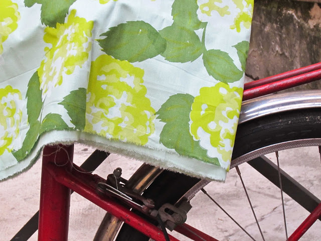
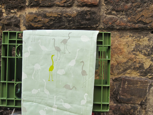
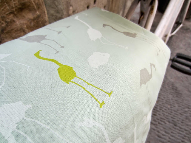
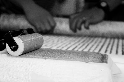
Transience and permanence. This collection anchors itself in the juxtaposition of beginnings and endings, expressing confidence in the face of uncertainty and joyful contentment in the present. As my sister began her college career and I finished mine, we seized the opportunity to spend a summer together studying textile design and photography in Florence. While there, I crafted a small line of fabrics inspired by her graduation party—hydrangeas, bunting, and striped paper straws. As I reminisced on our time together and began to sew summer fabrics into autumn projects, this show was born. It contrasts the deep constancy of family against the transience of growing up through a medium that has long accompanied those disparate pieces of life: quilts. From births to weddings to graduations, quilts commemorate transitions in life. Drawing on the tradition of the simple one-block quilts of the Amish, I utilized large flat planes and solids, bringing it to the modern quilting scene with fresh colors and straight-line stitching. Each quilt contains a printed snapshot of our summer together—laughing and exploring—as well as a look into the past and future through the meanings of the traditional quilt blocks.
The show title is taken from Proverbs 31, which describes a woman who is successful in her business endeavors as well as at home but grounds her strength and carefree nature in Christ. She can laugh, enjoying the present without fear of the future, just as I hope we can embrace the now and hold what might come with excited and open palms. I invite you to enter into these moments, feeling the tactile changes in direction our lives take as well as the unity of family and faith that undergirds each quilt and story.
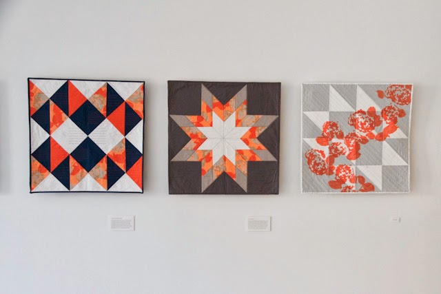
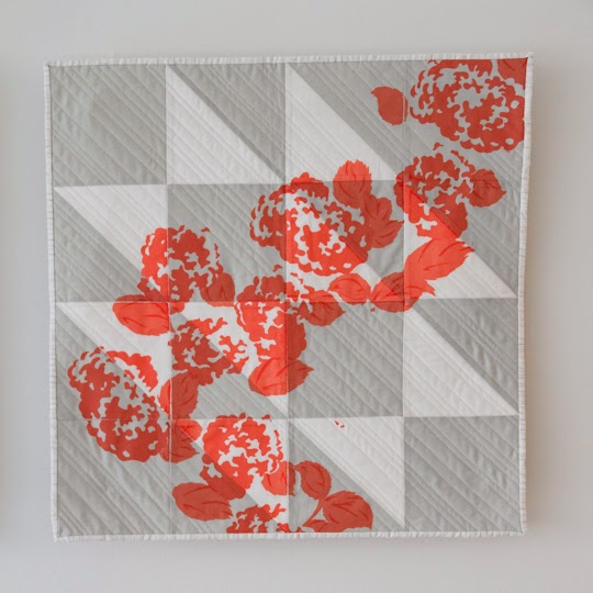
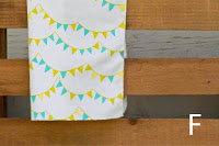
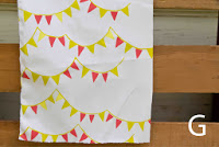
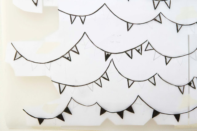
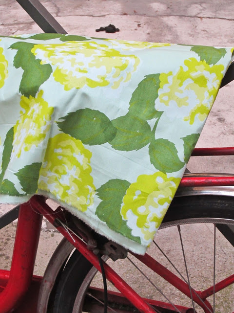
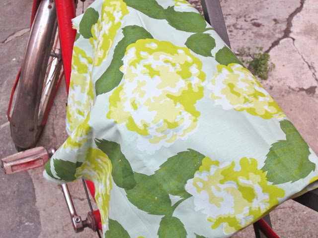
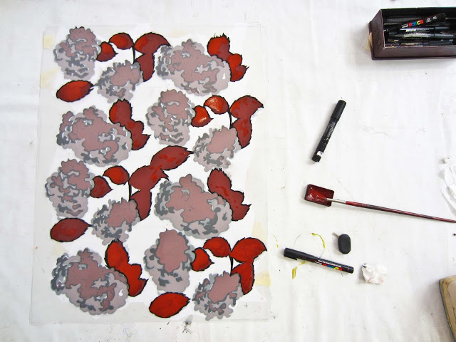
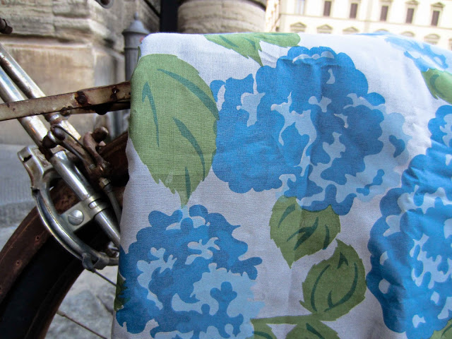
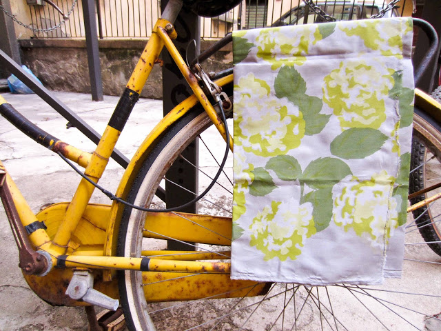
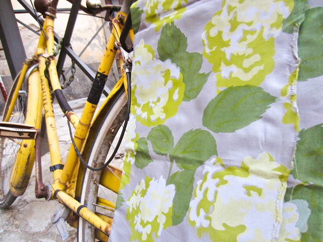
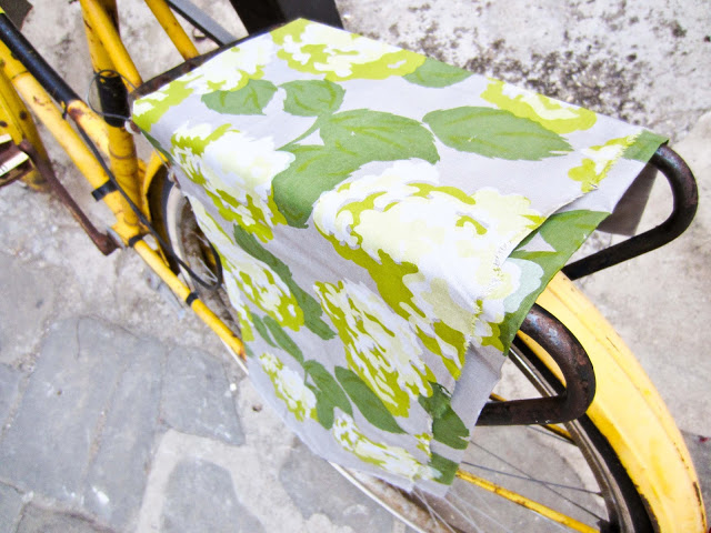
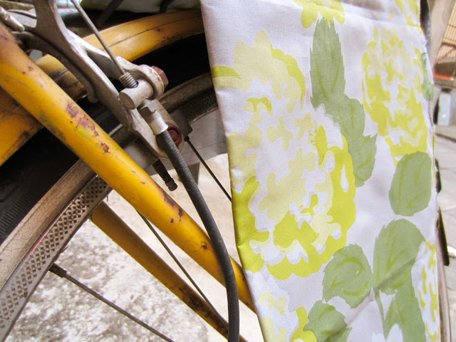
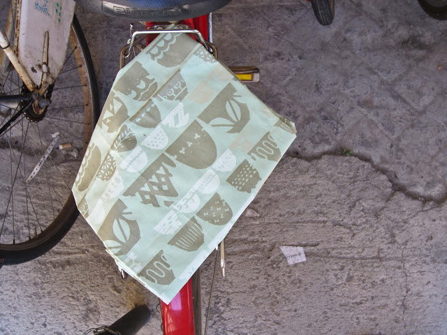
Remnants of Summer
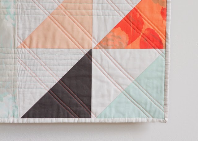
With
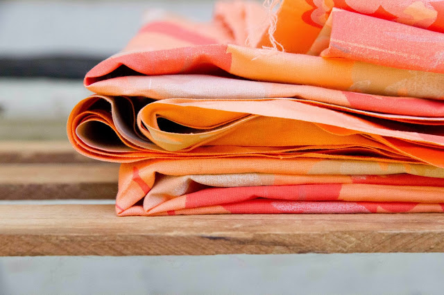
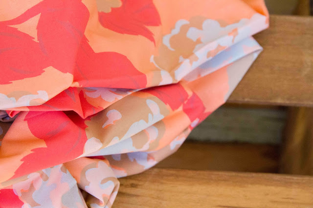
little pieces of hydrangea fabric from the summer as well as an overprint of
hydrangea design, this block brings me back to walking the hot streets of
Florence with my sister at my side. Freckles and sandals and sketchbooks in
backpacks. However, rather than settling into nostalgia, I like to remember the
many things that have grown from that month: a deeper relationship with my
sister, a year of studying fabric design, a beautiful quilt from the fabrics we
purchased at the markets, this show. Dwelling on the past is not productive. Appreciating,
instead, the unfolding of moments into long-lasting treasures keeps us thankful
and grounded in the present and future.
Variations on a Bouquet of Tulips
Life doesn’t always happen as you expect, but
often then it is better. My sophomore year, I was surprised with a bouquet of
tulips after one of my dance performances from a friend who then asked me to
dinner. I was flattered and excited, but the relationship didn’t take off and
ended up rather awkward. This year, though, I was surprised again with a
beautiful bouquet from two of my chemistry major friends. We all chatted and
laughed and had breakfast together the next Friday as we had all semester.
Great friends, good conversation, and lots of fun. Sometimes the best moments
are subtle variations on what you would’ve picked for yourself.
Lovely & Enough
The title of my blog and this quilt encompasses a lifestyle to
which I aspire. My life is so full of blessings: a loving family, a great group
of friends, a burgeoning church, and my knitting and quilting. I want to live
happily and contentedly in this and remember that my life
is lovely and enough. Quilting through physical chemistry tests,
documentary photography classes, friend drama, and stressful dance
performances, I choose to work with my hands and lead a life that reflects the
great wonder of life rather than the minutiae. This lone star block, with its
classic pattern and single star represent the beauty in simplicity and the joy
that can bring.
New Growth
Sold
Coming & Going
Windmill
Wings
I've
grown up hearing the phrase, "If you ain't Dutch, you ain't much."
This, of course, isn't true, but I feel very connected to my Dutch roots and home
church. Originally titled End of Day as
a block in the Farmer's Wife Quilt, I am renaming this block Windmill Wings as an homage to my
heritage and the Benjamin Moore color I painted my room as a little girl. It
speaks of a solid foundation in my life—my Dutch church family and home—from
which I can now springboard into a wider body of fellow scientists, artists,
and Christians. The end of each day and phase of life is then not a conclusion
but the groundwork for winging into the next adventures of life.
Little Pieces
This is our purpose: to love one another as He loved us. Being
afraid of the unexpected turns life throws crushes faith and spontaneity.
Rather than worrying, we can instead focus on the beauty of each moment so that
any little pieces we leave in our past among close or lost friends, realized or
broken dreams are beautiful and untainted with regret.
Sold
Ties
Initially titled Ribbons in
the Farmer’s Wife Quilt, I shifted the title to Ties to reflect family relationships. Our ties to family can at
times feel like shackles and other times like an anchor amidst the storms of
life. No matter the effort taken to cut them or the misguided attempts to
bolster, these ties remain invisible and unbreakable.
Evening Star
Sold
Fresh Starts
This is it. The show I've dreamed about since deciding to be an artist as well as a chemist. It brings such a lightness to my life to have both sides. Never during the senior show process did I wish I had just stuck to chemistry. (Well, perhaps once, but it was probably 3:30 in the morning or 3:30 the next afternoon as I feel asleep in my third class that day, or more likely 3:30 the following morning when my walking foot broke.) Finishing the show at last is an enormous sense of accomplishment, and it brings me such joy to sit in the gallery in the peace and quiet. Even better is having people come to me after visiting the gallery with stories of how it touched them. College is full of transitions in locale and in family, and I am so thankful to God for the ways He can speak to each individual person's situation through the things He put on my heart for the show.
A special thank you to Mary and Andie, my Mom, my Dad, my sister Taylor, my Grandma and Grandpa Bolt, my Aunt Lisa, and everyone else who was able to make it out for the reception on Friday. Celebrating with you was a wonderful culmination of my time at Wheaton. And to all who were unable to make it due to distance and previous commitments, extensive documenting of the show can be found over on
Flickr.
PS Somehow I missed taking pictures of my favorite quilt, Remnants of Summer, and since it was the one finished at three in the morning the day it was due, it has never been posted on the blog either. I will make sure pictures are posted this week, so stop back by to see them.