Back After a Two-Year Hiatus
It was been two years since I celebrated the Lenten season with weekly quilt meditations. But in 2019, I had just begun my full-time job as a project manager at a biomedical research institute, and 2020 was, as we know, incredibly turned upside down with the COVID19 pandemic hitting a few weeks into Lent. With that in mind, I return to Lenten Twelves in 2021 with grace for myself for the two-year gap in this practice.
Curious what “Lenten Twelves” is? Check out my landing page for this meditative quilt series – Lenten Twelves: a Creative Practice.
Theme: Variations on an Irish-Chain Quilt
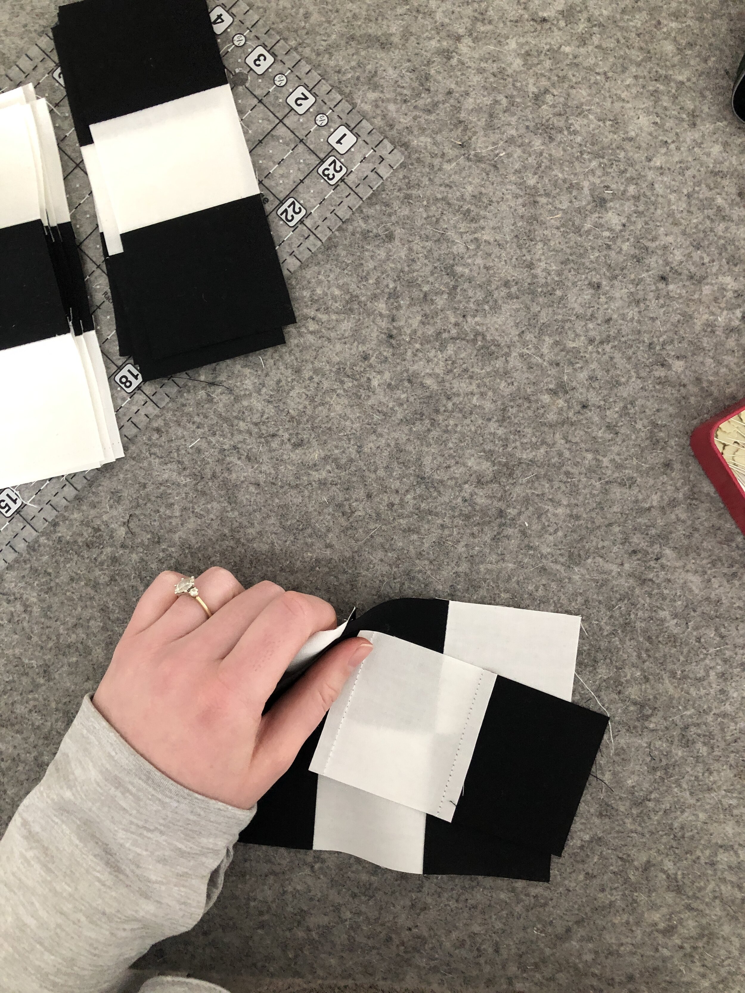
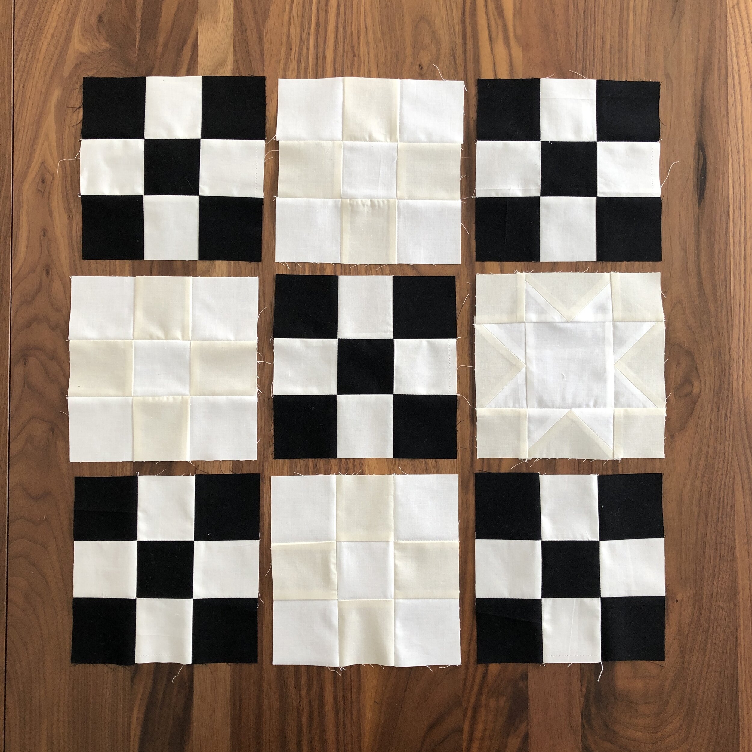
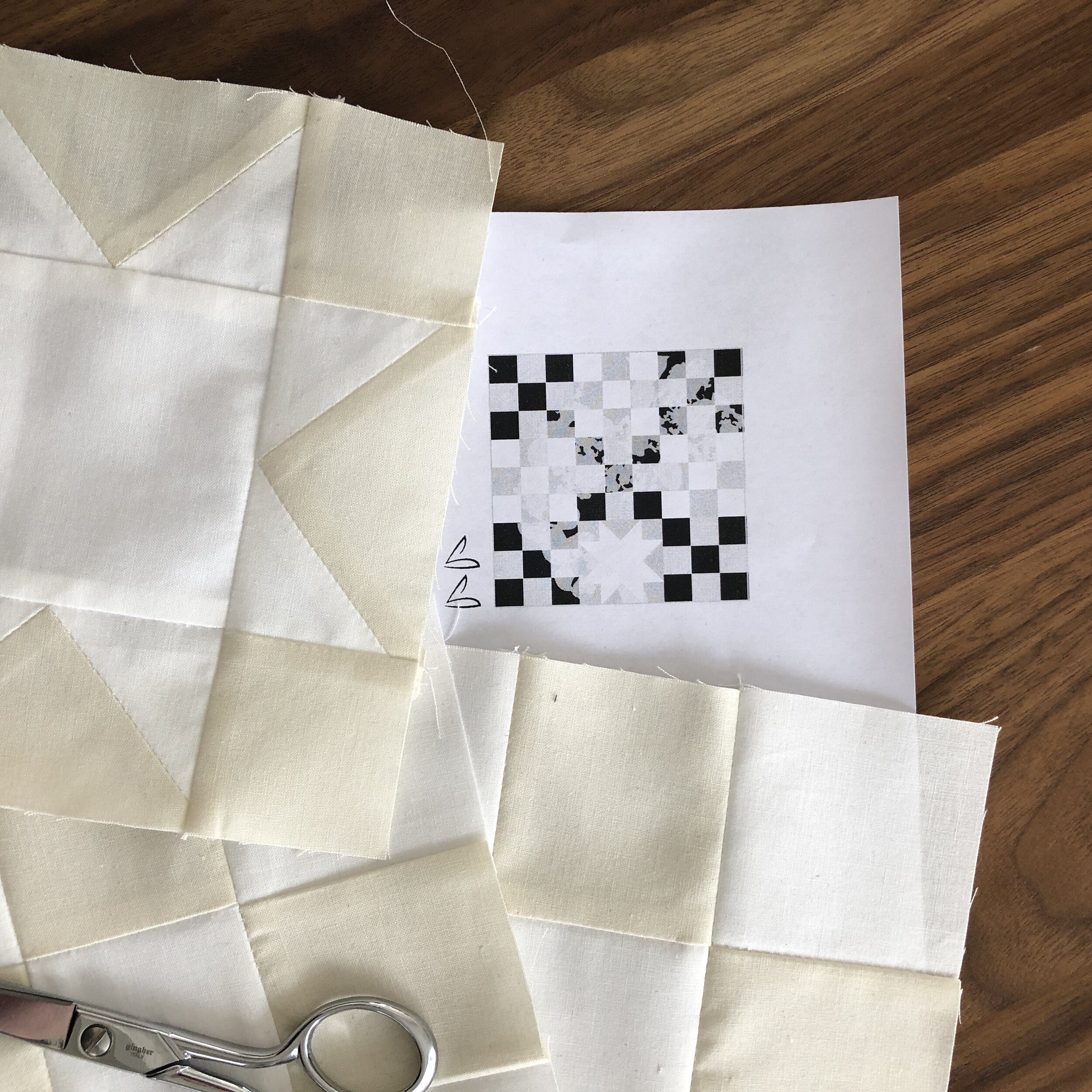
This year, I am exploring variations on a theme with an Irish chain quilt as the starting point for my creative explorations. My color palette draws inspiration from my large Black and White Twelves quilt, using black, white, and a variety of creams to explore pattern, focal points, and layering. You can follow along these series on Instagram through the hashtag: #LentenTwelves2021.
Quilt theme: Irish Chain quilt, inspired by the Campfire Glow quilt
Color palette: black, white, and cream, inspired by my Black and White Twelves quilt
Reading: The Cure for Sorrow: A Book of Blessings for Times of Grief by Jan Richardson


The Cure for Sorrow
Having lost so much this year—even if the loss feels intangible—I am taking this season of waiting to read The Cure for Sorrow by Jan Richardson. The book is full of blessings written surrounding the early death of Jan’s partner. Many feel poignant in this time of separation of loss of closeness and normalcy. In response to these readings, I have been writing short poems of my own, and I will share these here and in my Instagram stories. I have included some of my instagram stories at the end of this post if you are not instagram savvy or have given up social media for Lent.


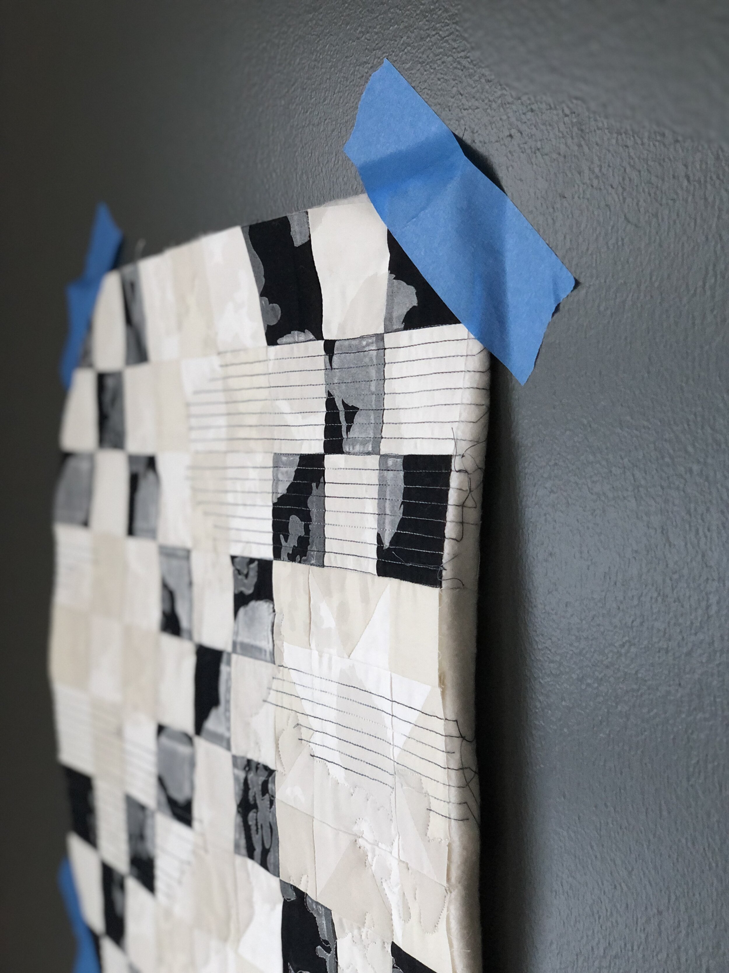
Printed, Then Overprinted
I started by printing the entire quilt with white hydrangeas. I love the texture it added. However, the all-over quilting didn’t lend a focal point to the quilt, and the white printing ended up being more subtle than I expected with such a contrasty background. This led me to experiment with overprinting the quilt after it was quilted, choosing a dark burgundy for my overprinting. Success was mixed… The quilting had shrunk the quilt a bit, so the burgundy overprinting did not align well to the original white blooms. Plus, the burgundy feels a bit out of left field in terms of design concept.
I don’t have a good picture yet, but will try to post later. I am waiting to make a final judgment on the quilt until I have finished the whole series. If worse comes to worst, I will cut it up and salvage the section of the quilt (about 9” square) that doesn’t have any printing on it.


Variegated thread adds movement
I also experimented with my thread choice, trying a variegated thread for the first time. My mom recently used a variegated thread to quilt one of her art quilts to great effect. Inspired, I ordered some black and white variegated Aurifil thread (Graphite 4665). Good news: I love it! The variegation is subtle when sewn over a black and white background, but I love how the thread disappears on the black in some places, while showing up bright white against the black in other places. It adds subtle movement to the quilt, guiding your eye across the straight-line quilted sections. Note: Aurifil Graphite 4665 has a bit of a blue cast to it that I wasn’t expecting but didn’t end up minding.
I am already scheming about ordering a second spool of variegated thread in cream/tan/white.