Sometimes I can’t decide which I like more: the thrill and excitement of an experiment or the confidence of a sure thing. Experiments are full of possibilities, potential breakthroughs, innovative ideas. They also come with nervousness, the chance of failure, and many pauses for consideration. Tried and true methods, on the other hand, can be carried out with speed and confidence. Also, lest we forget, tried and true methods are not always boring or lacking in innovation; sometimes they are the successes born of experiments that have been perfected into common practice.
Experiment : Gold Screen Printing
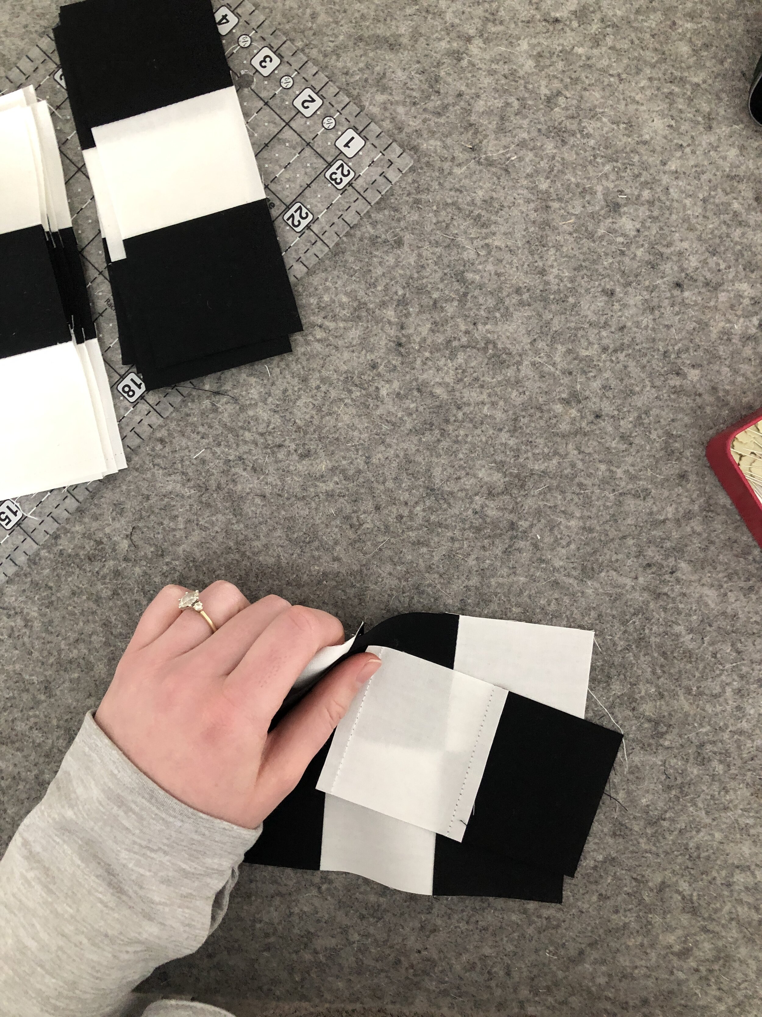
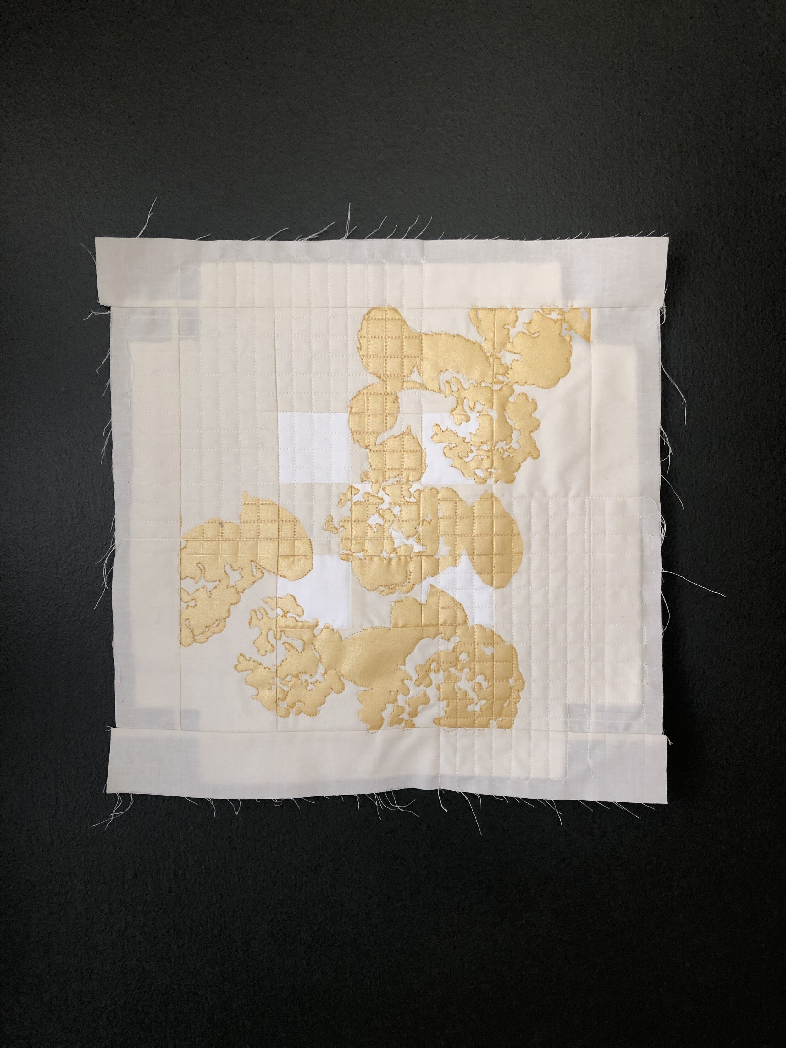
This week I picked up gold screen printing ink (experiment #1).
I have never printed with metallic before, but I have sketched and imagined the possibilities since visiting Prague and being inspired by the minimal gold accents adorning their many stone sculptures. A gold zucchetto graces a sandstone cleric blackened by pollution. A gilded halo floats above a blackened angel on the famous Charles Bridge. Saint Elizabeth wields a golden scepter over the tourists and locals.
Unfortunately, my local art shop was out of the small jars of gold textile screen printing ink. Not wanting to wait, I opted to dive in to this experiment with acrylic ink (experiment #2). The ink was silky smooth to print with (although I can’t be sure the texture difference between the acrylic gold ink and my textile ink isn’t age-related rather than substrate-related).

Results: beautiful gold printing
I still want to experiment with the gold ink more to really grasp its versatility and uses, but so far, I would consider it a success. Due to its metallic nature, the gold ink looks darker from some angles and lighter and more subtle from others. I would be curious to see how it plays off darker fabrics.

Experiment : Canvas-mounted Quilt
This is something I regularly wrestle with as I create wall quilts: how can an art quilt be easily and masterfully hung? There are several methods for finishing the edges of a quilt other than traditional binding, and I hope to work on a tutorial series covering some of these methods. However, no matter how you finish the edges of the art quilt, you are still left deciding how to hang it on the wall. I have used velcro. I have used dowels. I have hand-sewed individual quilt squares to a piece of mat board. None of these methods have satisfied my desire for a method that elevates the quilt to the crisp finish of modern art without requiring painstaking care and copious amounts of fiddly hand-sewing.
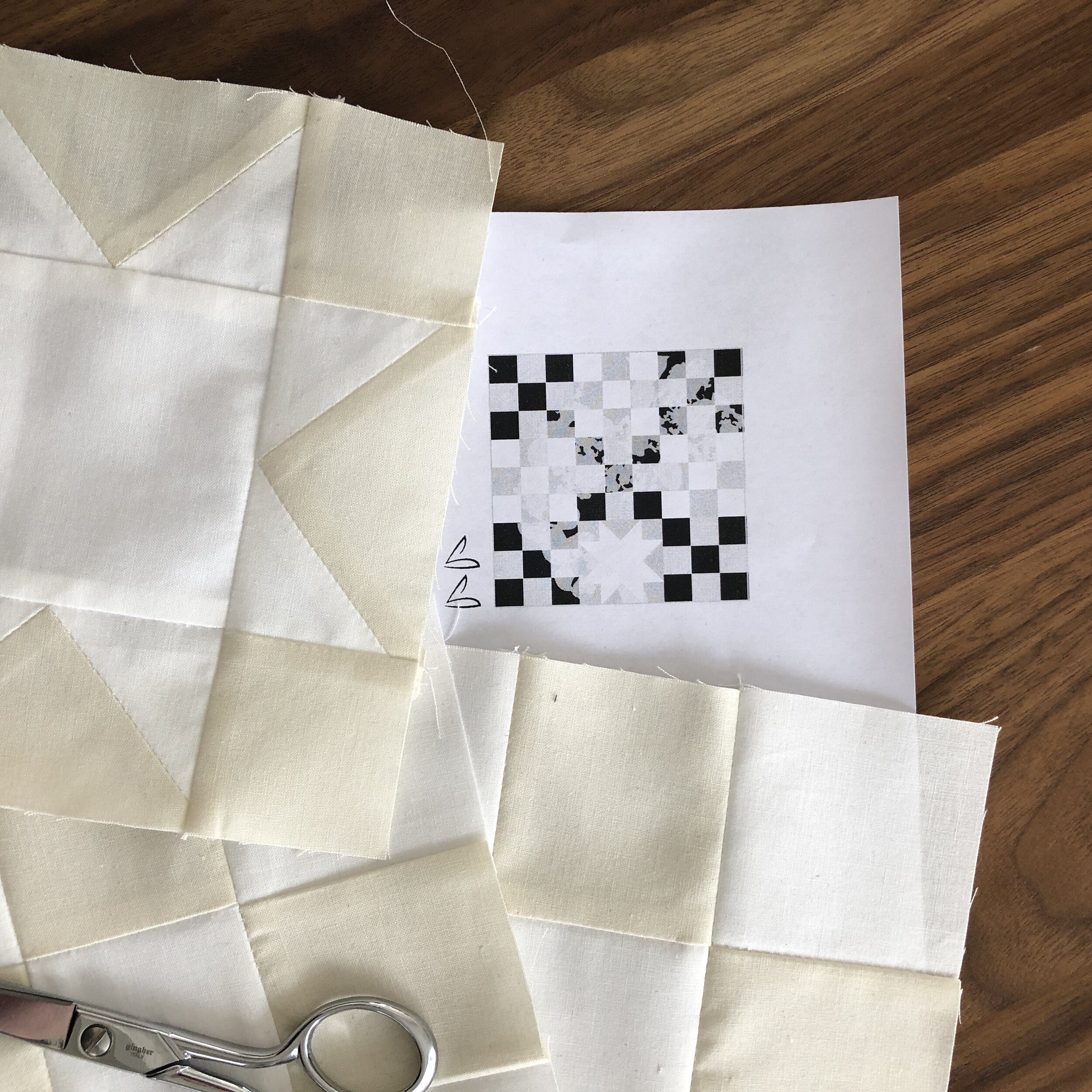
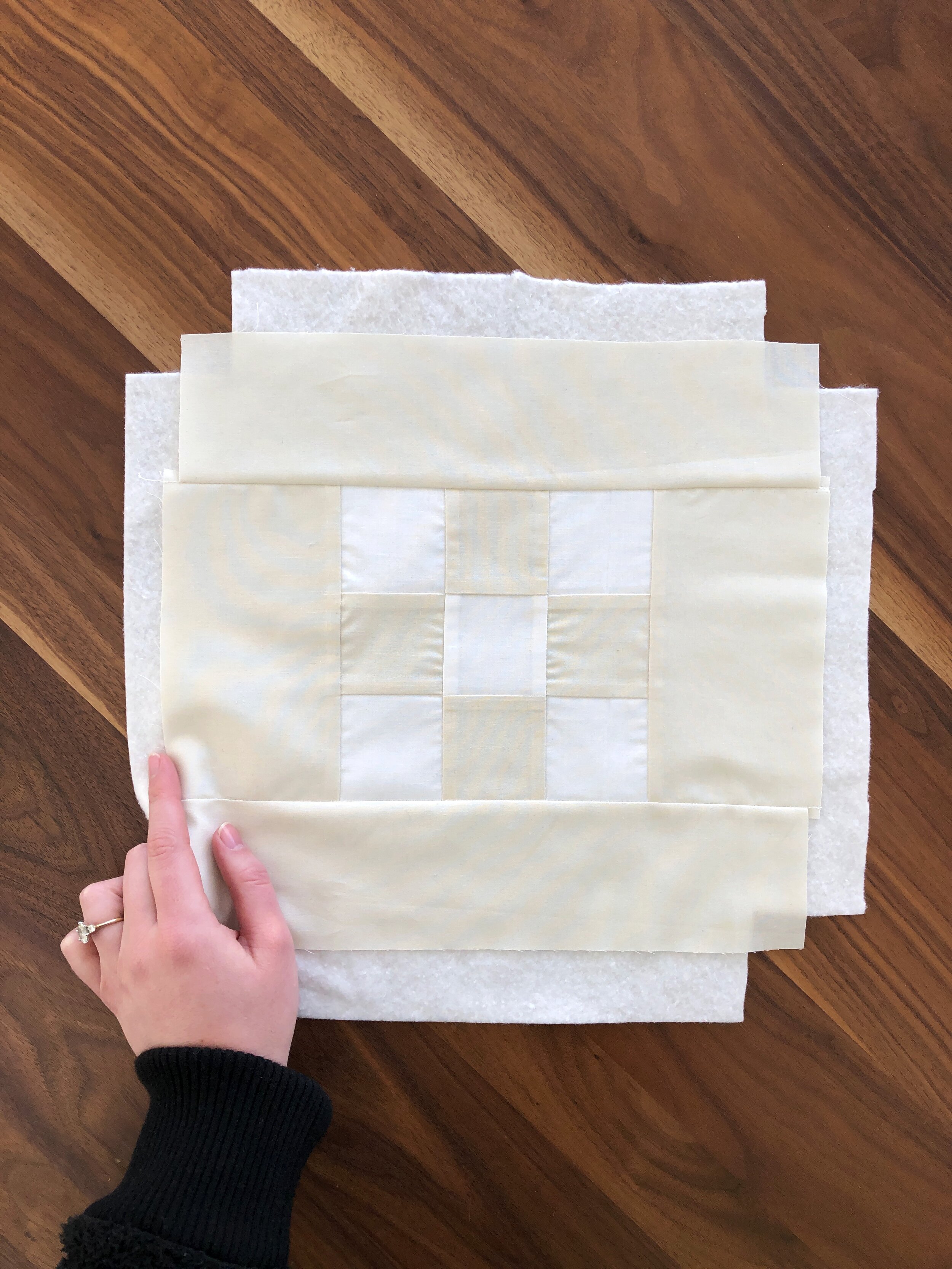
This week, I planned to try wrapping my finished quilt around a pre-made canvas (experiment #3). I added a border to the original composition in order to provide extra fabric for wrapping. Then, after printing on the quilt, I realized I had calculated the margin wrong and added more. I also cut my batting in a cross shape so that there would be no bulky batting to fold around the corners of the canvas.
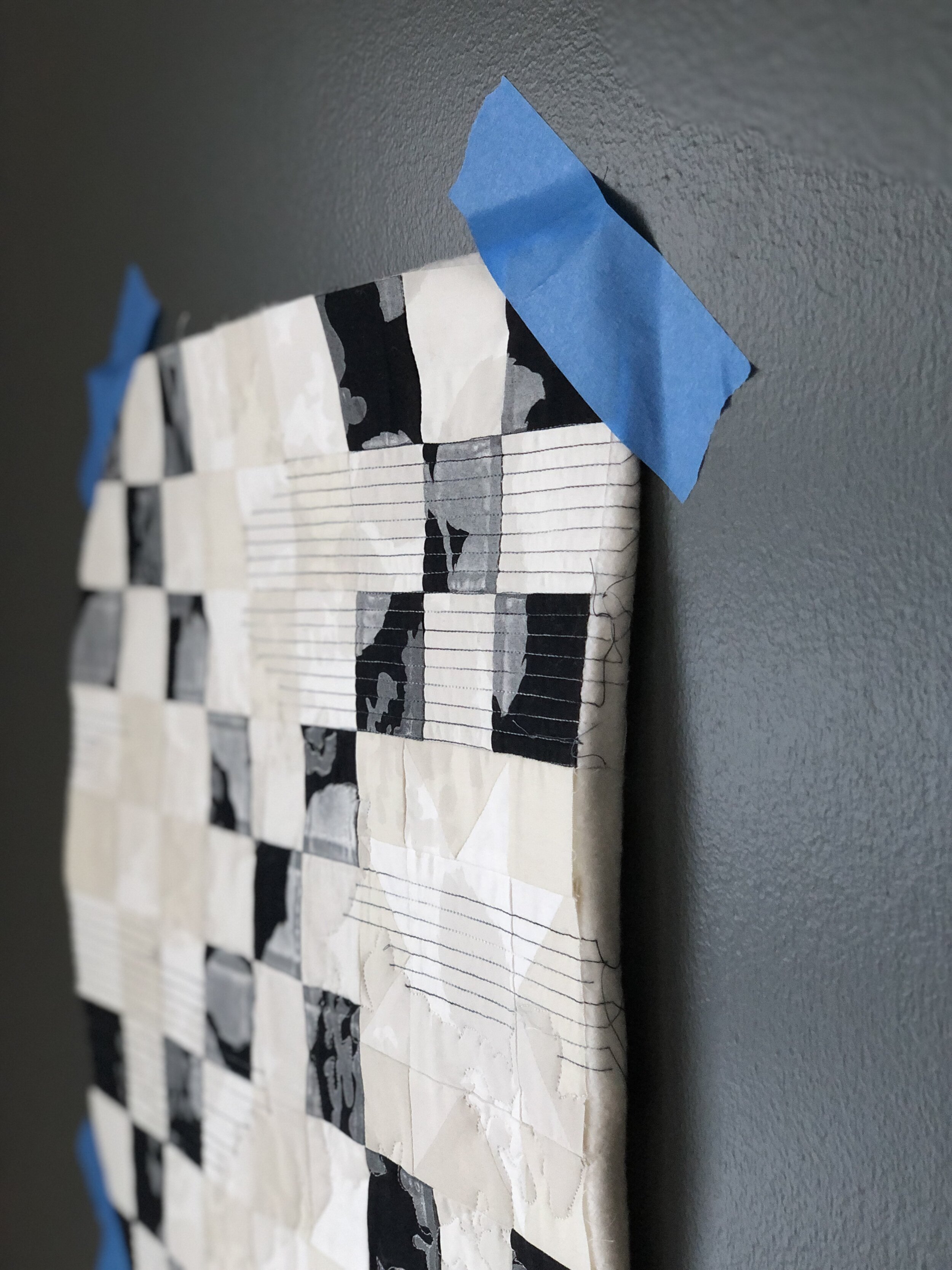
Results : trying French cleats next
After all this thought-filled preparation, when it came time to wrap the quilt around the canvas, I realized that I liked the quilt composition better with the borders that I had added (borders that would be lost to the edges and back of the canvas). Not to mention, I love how the gold printing is cropped by the outermost border. With this in mind, I padded upstairs to discuss the predicament with my partner and resident art-hanging expert. As a gallery director and once-art-museum-preparator, my husband is a treasure trove of expertise and talent when it comes to hanging artwork.
After some discussion, he suggested I mount the quilt on a 1/4” piece of plywood and then use French cleats on the back to float it in a frame. Enthused by this new idea (experiment #4), we drove to the store to get some MDF, short screws, and short staples. We don’t own a table saw, so my husband will cut the board and French cleats for me when he’s at work tomorrow. I am excited and hopeful that this system might provide a straight-forward and professional system for mounting and framing my art quilts. Stay tuned!


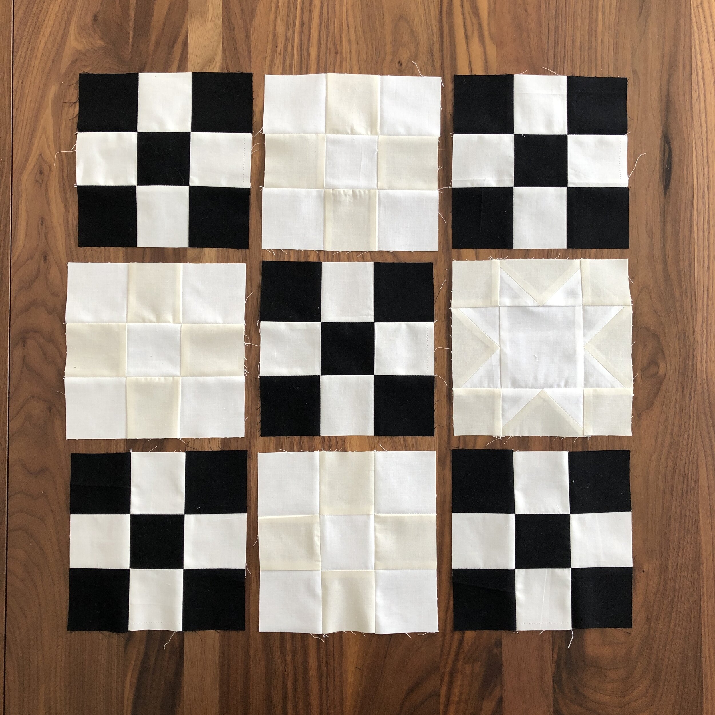
Lenten Twelves 2021
Follow the links below to read more about this quilt series or check out #LentenTwelves and #LentenTwelves2021 on Instagram. Curious what “Lenten Twelves” are? Check out this introductory post: Lenten Twelves: a Creative Practice.